


Hunguest Hotels
a leading Hungarian hotel brand
Project Team
Services
Field
Project summary
We were tasked with redefining the graphic identity for Hunguest Hotels, a leading hospitality brand with a nationwide footprint and strong recognition among Hungarian guests. The strategic objective was to reposition the brand around the concept of “renewal,” aligning with its ongoing property upgrades while signaling a shift away from an outdated, legacy-era perception toward a more contemporary, experience-driven offering—without losing its broad accessibility. A key priority was to elevate perceived quality while maintaining familiarity, ensuring consistency across all guest touchpoints.
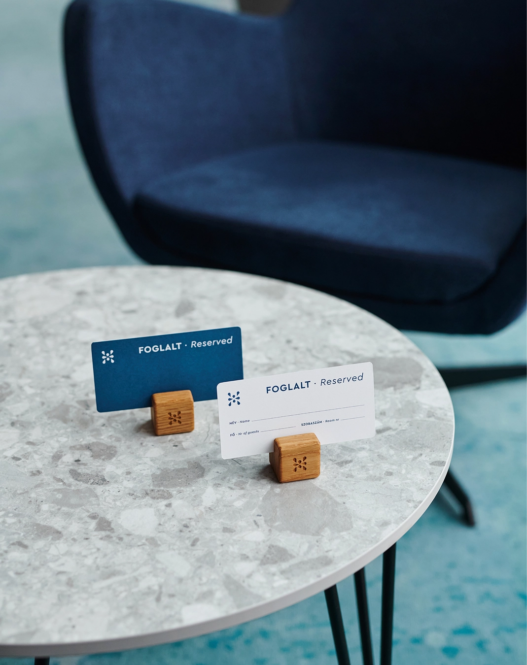
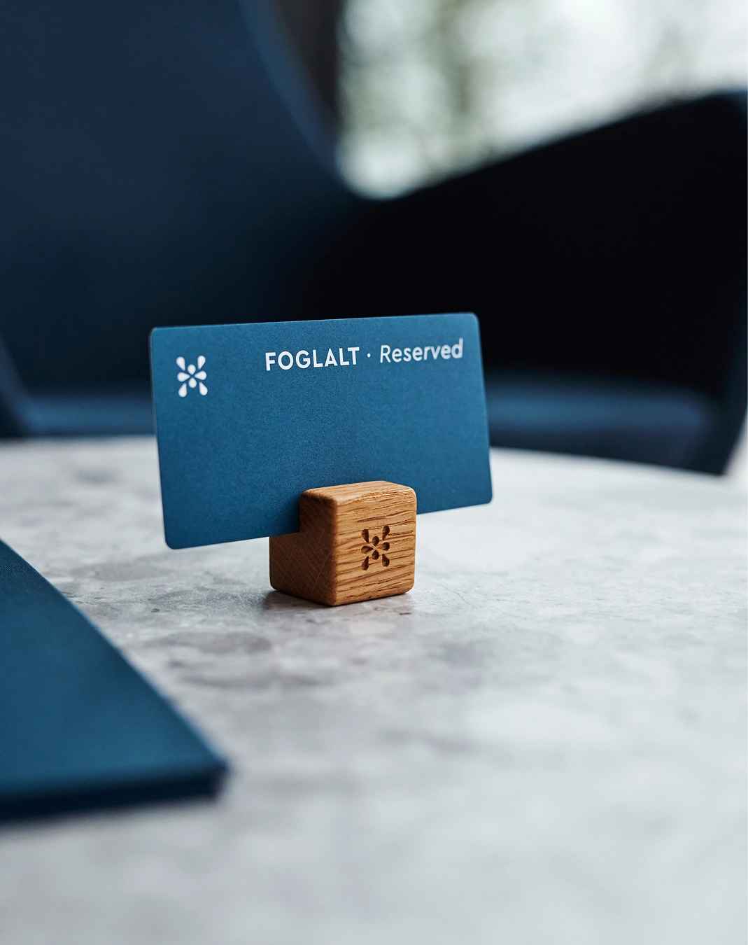
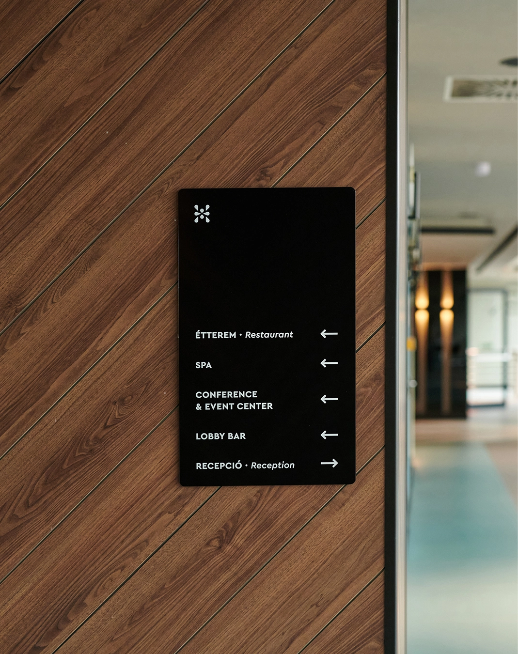
Our approach focused on building distinctive, ownable brand assets rooted in the symbolism of water—central to the brand’s spa and wellness heritage and widely understood by its core audience. The logo was reimagined as a capital “H” constructed from water droplets, supported by fluid wave and drop motifs integrated into the wider identity system. A refined blue color palette reinforces associations with wellness, clarity, and rejuvenation, balancing premium cues with approachability. This visual language extends into tactile applications, where considered production techniques—such as letterpress, embossed leather, and engraved wood—translate the concept of renewal into a cohesive, multi-sensory brand experience.






related projects
L'Été
Deux Freres
